

This is a series of my process work for the "Delusions of Grandeur" image I recently completed.
The first two pages are mainly idea pages. I was originally going to pursue a more typical "fantasy" type image and began trying to envision the dragon as well as the rider. This was ok but I felt it was very cliche. I wanted to do something slightly more original in the concept or idea of the image. So while doodling for ideas I came up with the idea of an actual knight riding a kiddie ride dragon. I got a few laughs from showing it to my wife and kids, so I was confident this was a good direction to go in.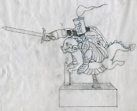

I took the image I roughed out on the right side of page 2 and began looking at reference pictures of knights and these types of rides. I did the first drawing on tracing paper (the one shown here is tracing number 3). This was done to solidify the line work so I could paint it easier. I made a copy of this sketch and used a set of gray scale markers to work up a set of values (range of white to black with NO color) that would make the shapes read.
From here, the image was taken into Photoshop where the real fun would take place! The final color version was resolved and some adjustments 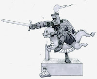 were made to the drawing to make the pose more natural and the to make the knight more awkwardly perched upon his steed. I knew that because of the complexity of his armor that the background needed to be somewhat simplified comparatively. So I chose a simple storefront location and let him ride.
The final image can be seen here. I hope you enjoyed following along with my process of creating this image. I feel it turned out pretty well and it was nice to get back to the basics of illustration. It has been a while since I've applied this fundamental approach to creating an image. This has been the way I've made most of my images but for whatever reason, recently, I've abandoned it until this image. So, now that I've 'found' it again, I need to hold on to it and apply it.
Thanks again,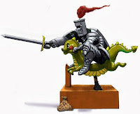
TTYL
 were made to the drawing to make the pose more natural and the to make the knight more awkwardly perched upon his steed. I knew that because of the complexity of his armor that the background needed to be somewhat simplified comparatively. So I chose a simple storefront location and let him ride.
The final image can be seen here. I hope you enjoyed following along with my process of creating this image. I feel it turned out pretty well and it was nice to get back to the basics of illustration. It has been a while since I've applied this fundamental approach to creating an image. This has been the way I've made most of my images but for whatever reason, recently, I've abandoned it until this image. So, now that I've 'found' it again, I need to hold on to it and apply it.
Thanks again,

TTYL


